The inch deception: why they are explaining the screen size of mobile phones and folding phones poorly
If you’ve ever had that impression, don’t worry because you’re not crazy: cell phones are getting bigger.
But it wouldn’t be strange if when you see the data in inches you get a little confused because there doesn’t seem to be a big difference between compact phones and the largest ones today, which all range between 6 and 6.8 inches.
But then, if there is only an inch or less difference between many phones, why do some appear so much larger than others?
Let me tell you the deception of giving the measurements of mobile screens in inches and why folding mobile phones are the perfect example that this system must be changed.
Measuring diagonally: virtues and defects
When a brand tells you that its mobile phone is X inches, it is giving you the measurement of the diagonal from one corner of the screen to the other.
And since all screens are rectangular, it would be logical to assume that there is no problem. But that’s where the format or aspect ratio comes into play, that is, the shape of that rectangle.
In televisions, inches are usually quite representative of the size of a screen because they all use the same format: 16:9, the television standard. Therefore, when you watch a movie, given that the aspect of the cinema is more elongated, it is common for you to see black bars above and below the image.
But cell phones are another story because the aspect ratio has evolved over time as screens increased in size and designs reduced frames.
For example: the first iPhone, from 2007, had a 3.5-inch screen and a 3:2 aspect ratio, so it was much more square. The latest model, the iPhone 15 Pro Max, features a 6.7-inch panel with a 19.5:9 ratio. That is, the height is already more than double the width.
The key would be to measure the surface, not the diagonal
If manufacturers wanted to make users like you better understand the dimensions of a screen, the solution would be to stop focusing on the diagonal data in inches and instead give the surface data, in centimeters or square inches.
For example: the iPhone 15 Pro is 6.1 inches and the iPhone 15 Pro Max has a 6.7-inch panel. It seems like 0.6 inches of difference isn’t much, right?
But the iPhone 15 Pro Max has a screen with 110.2 square centimeters of surface area, while the iPhone 15 Pro stays at 91.3 square centimeters.
Hence the screen is 20.7% larger in surface area. Isn’t it much better understood?
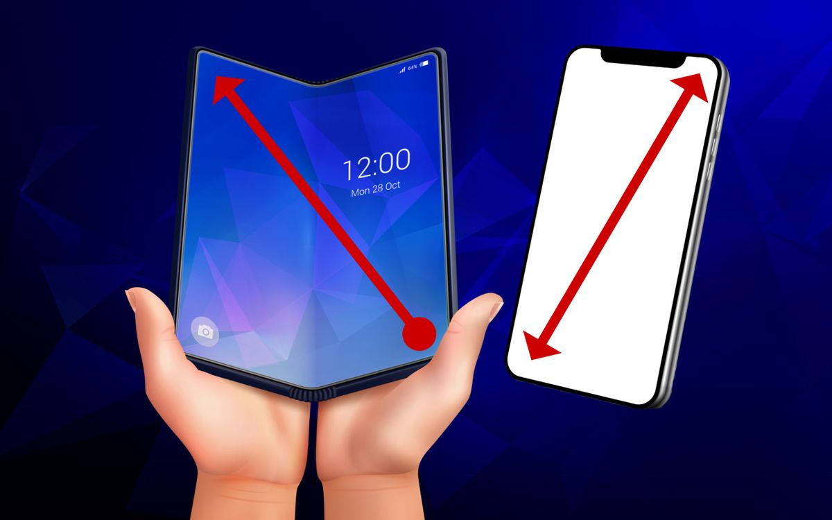
Folding phones complicate everything even more
Well, if the example of the iPhone 15 screens hasn’t seemed enough to you, folding phones have arrived in the industry in recent years to complicate things even more.
The oneplus Open, the brand’s first foldable, has a 6.31-inch exterior screen and a 7.82-inch interior screen. The samsung Galaxy Z Fold 5, for its part, has a 6.2-inch secondary panel and a 7.6-inch interior panel.
It makes sense to ask yourself: if the interior screen seems almost twice as big as the exterior one, how can they be only an inch and a half different?
Again, measuring diagonally leads to confusion because due to their shape, the folding book type has a rectangular outer screen similar to that of traditional mobile phones, while the interior is practically square.
But if we look at the surface, you can see that The OnePlus Open’s 7.82-inch screen is 196.7 square centimeters, more than double that of the iPhone 15 Pro with its 6.1 inches. And almost double its exterior screen too.
For the same with the Samsung Galaxy Z Fold 5, which with its 7.6-inch interior screen, almost doubles the panel of the basic iPhone 15 thanks to its 183.2 square centimeters.