The redesign of Google Maps has not left its creators indifferent: “They have lost a great opportunity, the map should be a sacred place”
The recent update of Google Mapswhich has changed its color palette, has been met with criticism and concerns. It has not left anyone indifferentnot even design professionals like Elizabeth Laraki, who 15 years ago helped create the navigation app.
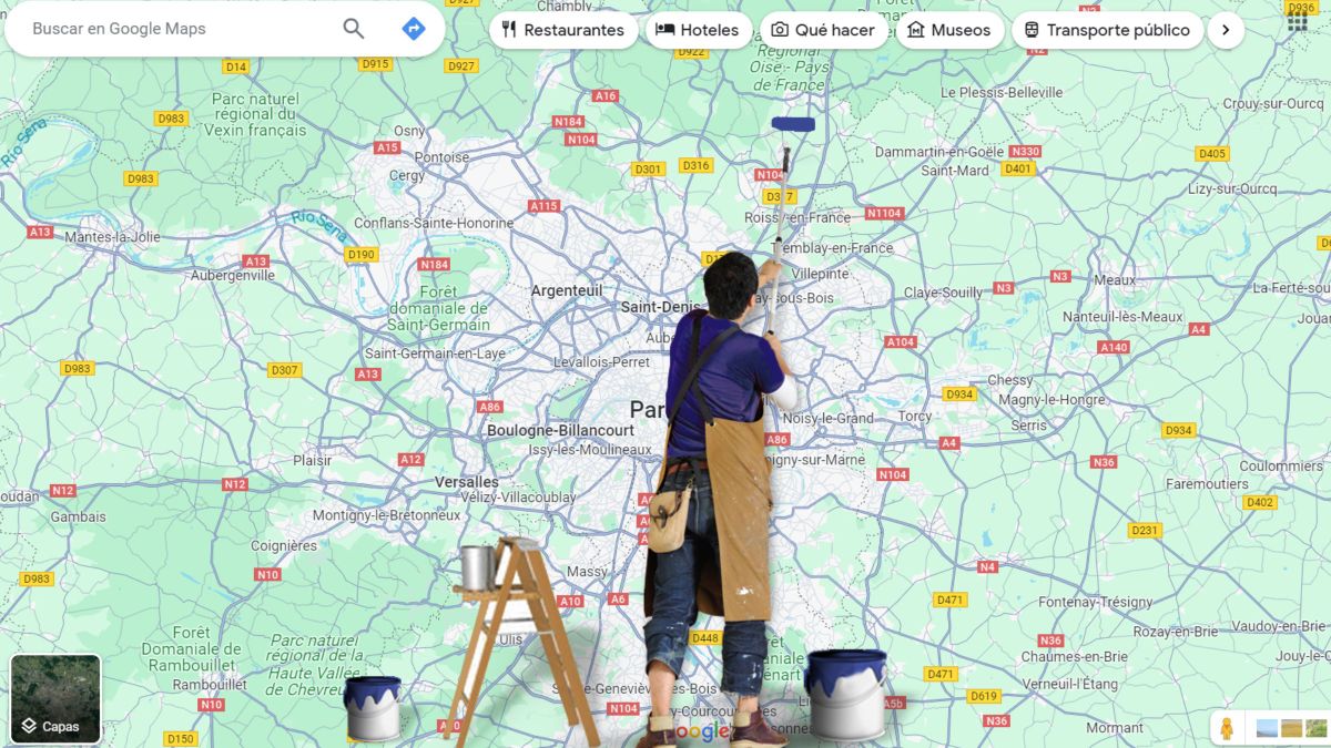
Changes to Google Maps colors, including gray roads, paler bodies of water, and darker forested areas, have sparked a debate about the usability and aesthetics of the application.
In his criticism, Elizabeth Laraki He points out on his Twitter account: “The map should be a sacred place, Google Maps should have cleaned the dirt that covered the map.” This statement highlights a concern for the clarity and simplicity of the map design in Google Maps.
Yes ok his criticism is not strictly towards the new colors: “It’s true that I think the roads, traffic and main trails stand out more now. But the colors of the water and the parks/open spaces blend together.”
Elizabeth Laraki
He is not convinced: “To me, the palette feels colder and more computer-generated. But leaving aside the color options, if the goal was better usability, the team missed a great opportunity,” he said.
With more than 15 years of product design experience at Google, YouTube and Facebook, Laraki suggests that Google Maps should have taken advantage of the change to simplify its interface.
What changes could improve Google Maps according to Elizabeth Laraki?
Elizabeth Laraki
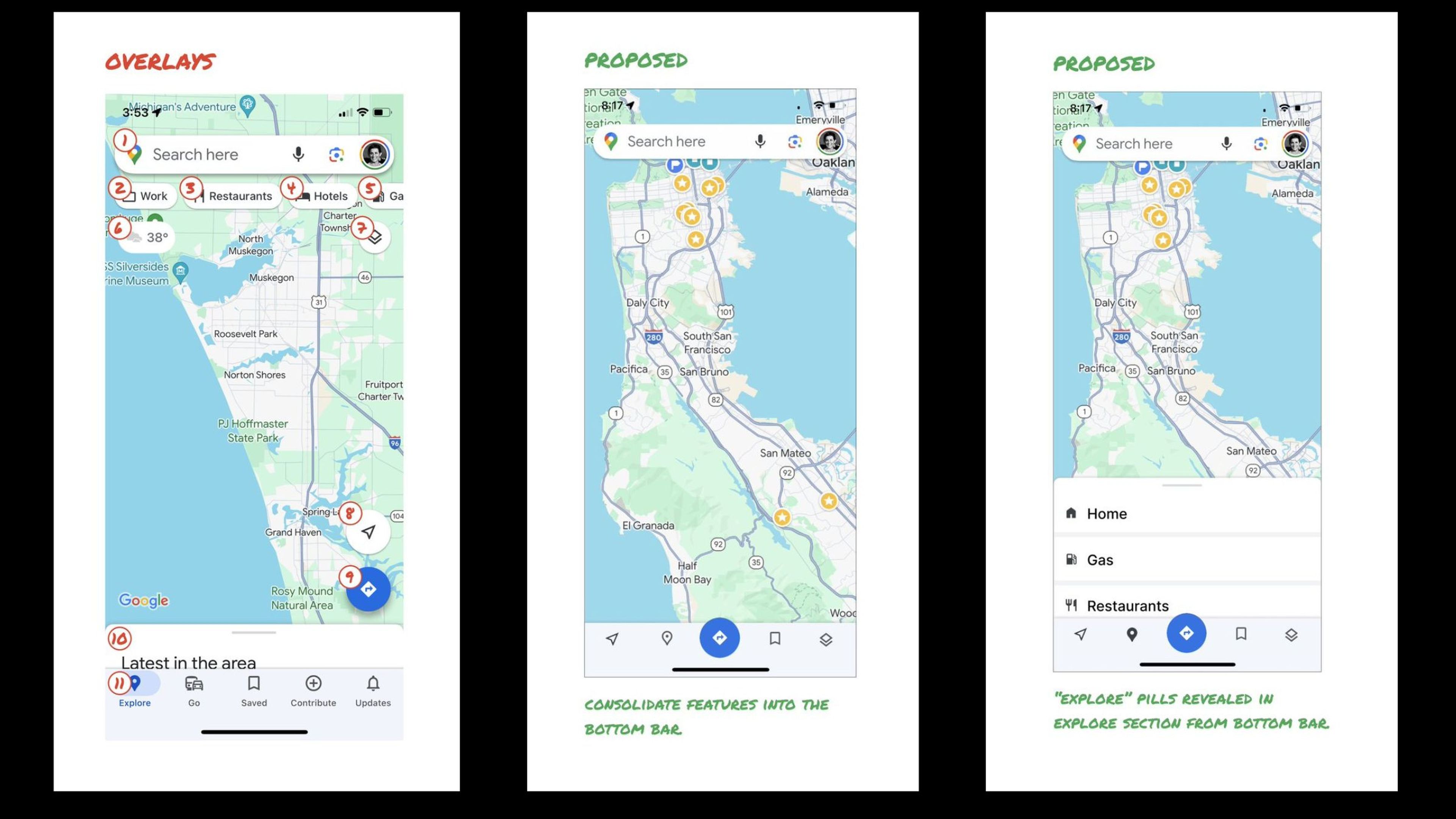
The designer proposes a drastic reduction of overlapping elements on the map, keeping only the search box and the bottom bar. According to Elizabeth Laraki, this simplification would significantly improve the visibility and usability of the map.
In addition to simplify the interface, advocates a hierarchy of functions in the application. Most used features, such as the search box and directions, should remain prominent, while less used features could be relocated.
For example, the Map layers like satellite and traffic could be moved to the bottom barand exploration options like restaurants and gas stations could be integrated into an “Explore” menu in the bottom bar, opening as cards.
These proposals reflect a design philosophy focused on clarity and functionalityprioritizing user experience over feature accumulation.
Laraki emphasizes the importance of an intuitive design that allows users to access the necessary functions without visually overloading the interface.
The designer recognizes that over time It is normal for them to accumulate new functions, even more so with the arrival of artificial intelligence, and that this can produce an excess of information, but consider that this is precisely the challenge, to be simple, as well as complete.
Google Maps focuses on immersion, emojis and public transportation
At the moment, it seems that Google Maps will focus, however, on adding more collaboration between users, emojis, more information on public transport routes and more immersion in images. On the other hand, competitors like Waze advocate for features to increase road safety.
Meanwhile, users unhappy with the current changes are using tricks in the mobile app to return to the classic color palette, although this solution is not available for the web version.
The debate around the design of Google Maps illustrates the complexity of balancing innovation, aesthetics and functionality in widely used applications. With the criticism received, Google may consider future adjustments, maintaining an open dialogue with its community of users and design experts to continually improve its service offering.