In recent days, Google has implemented several important new features for Maps, to which the renewed color palette.
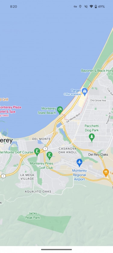
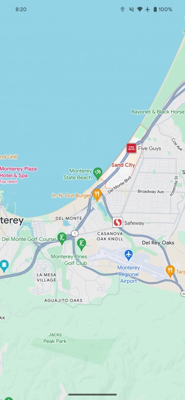
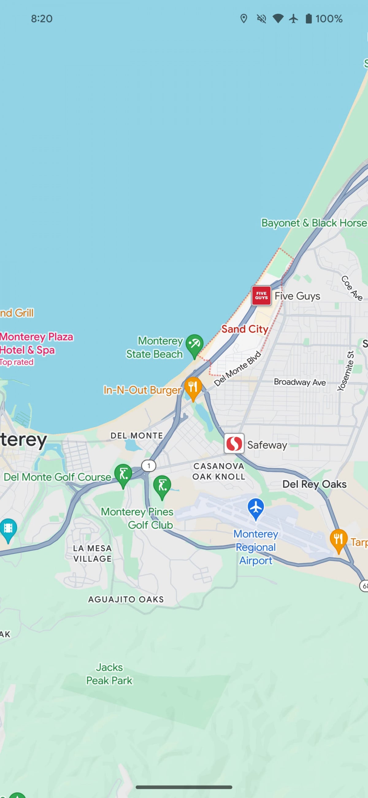
The overall impact is significantly changed by the choice to use one lighter shade of green for natural elements such as parks (highlighting the paths a little less), then creating a greater contrast with the streets that go from dirty white to grey. This choice allows you to go to highlight pedestrian crossings in white, which are now displayed at an increased size. Below are some before and after examples.
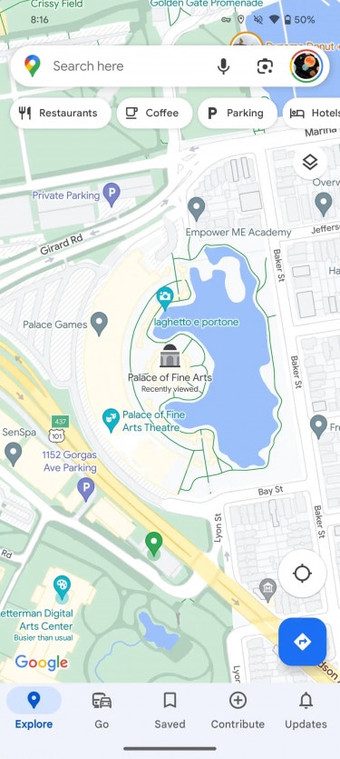
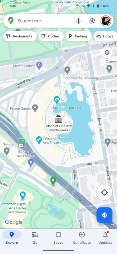
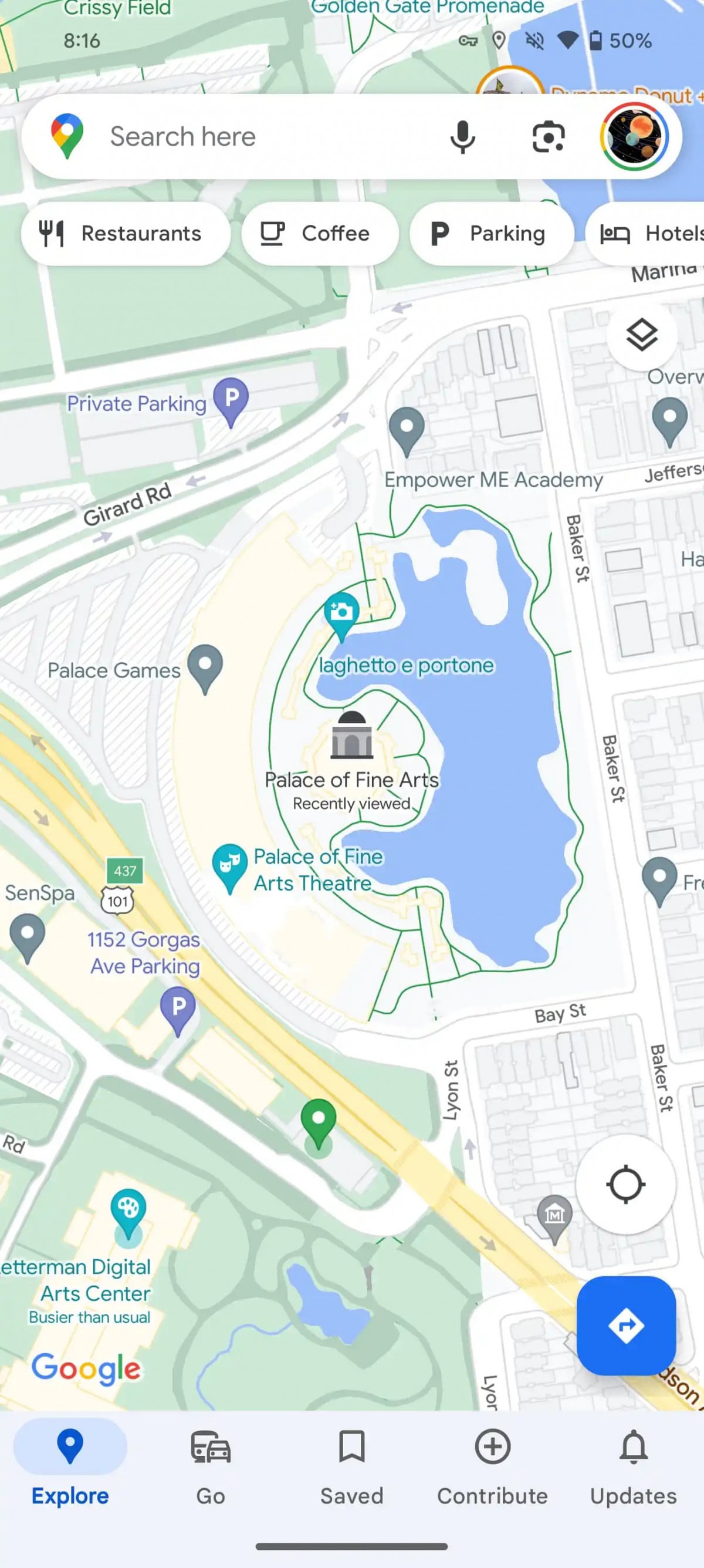
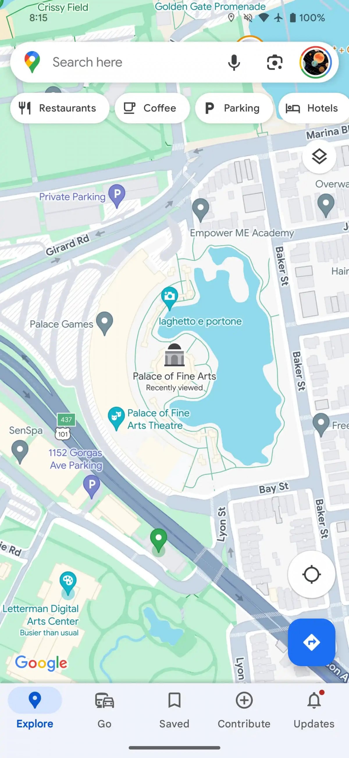
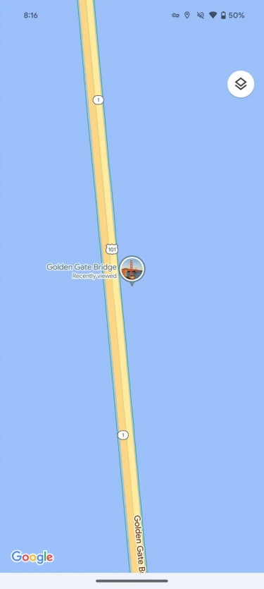
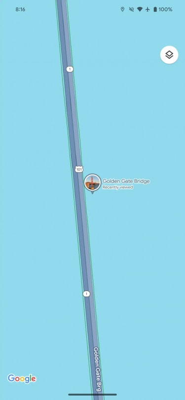
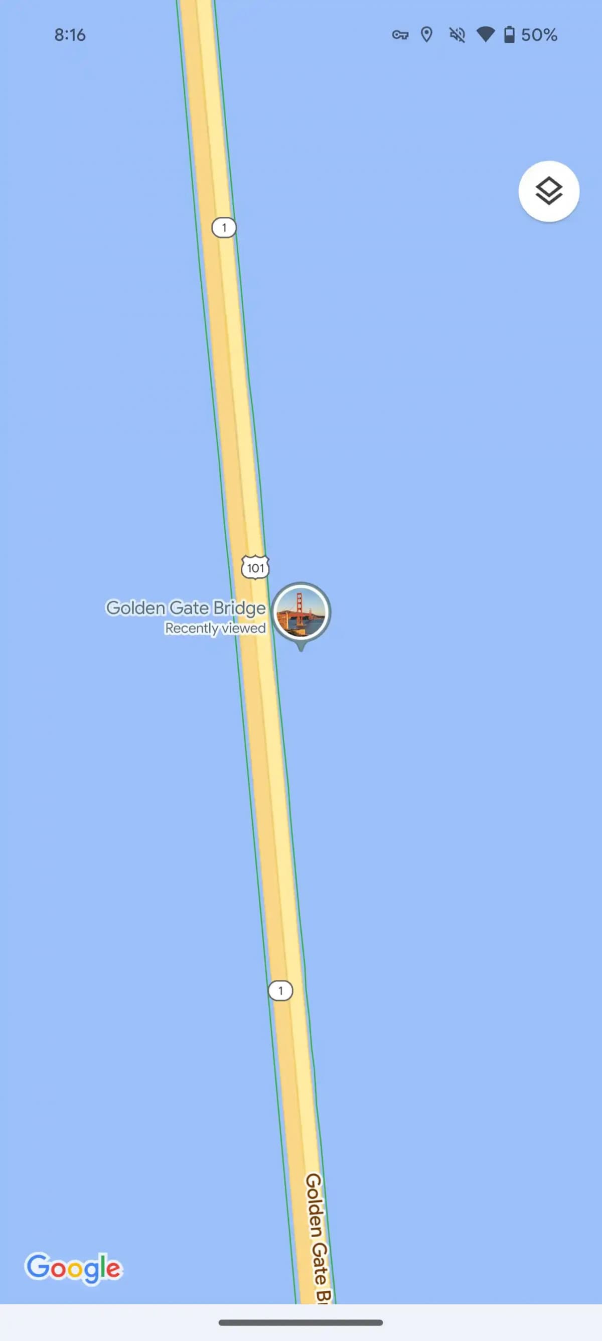
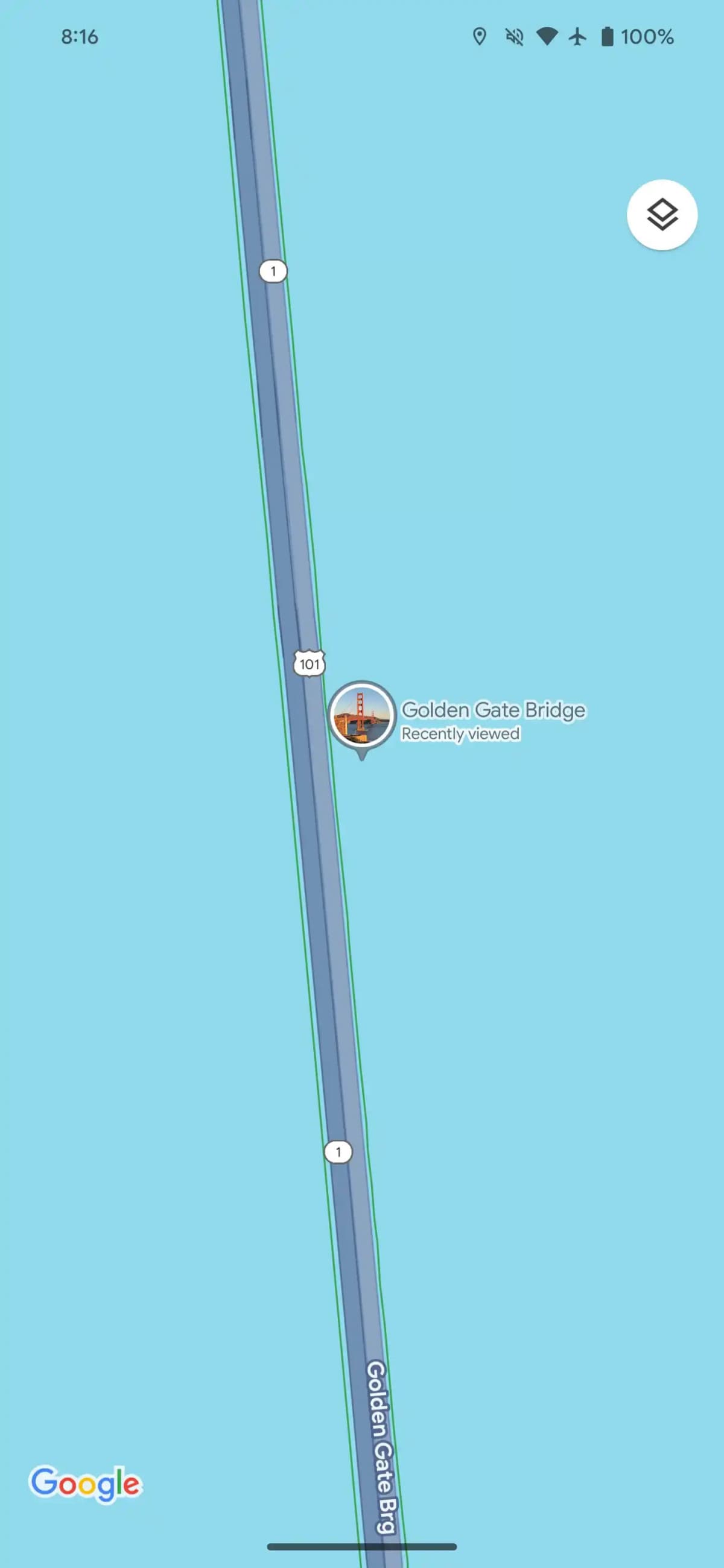
Highways turn a much darker gray, for sure much more coherent compared to the past but it turns out to be less obvious especially in contexts that include water. The changes are certainly very noticeable but they seem to have been very inspired by the application Maps of Apple.
Testing for this color update began in August and then, according to Google, implemented the new feature during the month of October.
Some users have noticed the update for several weeks now but now it seems to be underway wider distribution for both iOS and Android.
What do you think about it? Do you appreciate this change of colors for Google Maps or did you prefer the application as it was before?