The new page of Chrome it is a particularly important tab in the app, from which you can reach not only the news of Discover, but also your favorite sites (do you know what Chrome paths are?).
Because of this Google for some time trying to make it more and more functional and practical, and on Android something new in this sense is coming soon telephones, while on tablet Greater integration has been implemented with the Dynamic color: let’s go and discover them both.
New Chrome page on phones: a half step backwards?
As for phones, the new Chrome page has long been showing eight favicons favorites, as well as the latest searches on Google. The canonical grid is 4 x 2, i.e two lines of four icons each (image below left), but in Chrome 120 some users have started to see a different layout (image below right).
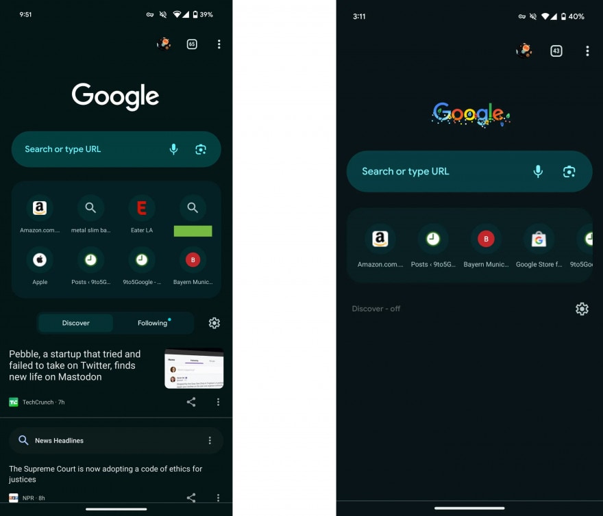
On the left the old new Chrome page. The new one on the right. Source: 9to5Google
As you can see, on the new page the favicons are inserted in a single line and you have to swipe to the left to see everything.
The news could have a double impact. For those who use favicons a lot, it doesn’t seem like a improvement of experience, as it requires a further step to access some of the sites, but evidently Google has found that the majority of users use Discover, and therefore decided to give more space to this function.
Google had already attempted to introduce something similar to mid 2022but then he had it abandoned, so we don’t know whether or not it’s here to stay.
According to several users, a similar modification is also in development on Chrome desktopbut we haven’t seen it yet, nor on Android, despite having mounted the latest beta, nor on computers, so evidently it is not yet widely spread.
Tablets are increasingly Material You
Always up Android, but come on Tablet, Google is introducing a new feature regarding the Chrome status bar, above the row of tabs.
While previously, with the dark theme of the interface, it was Black (image below, top), now (image below, bottom) the theme follows Dynamic color of system.
The novelty manifests itself only with the dark theme and not with the clear theme.
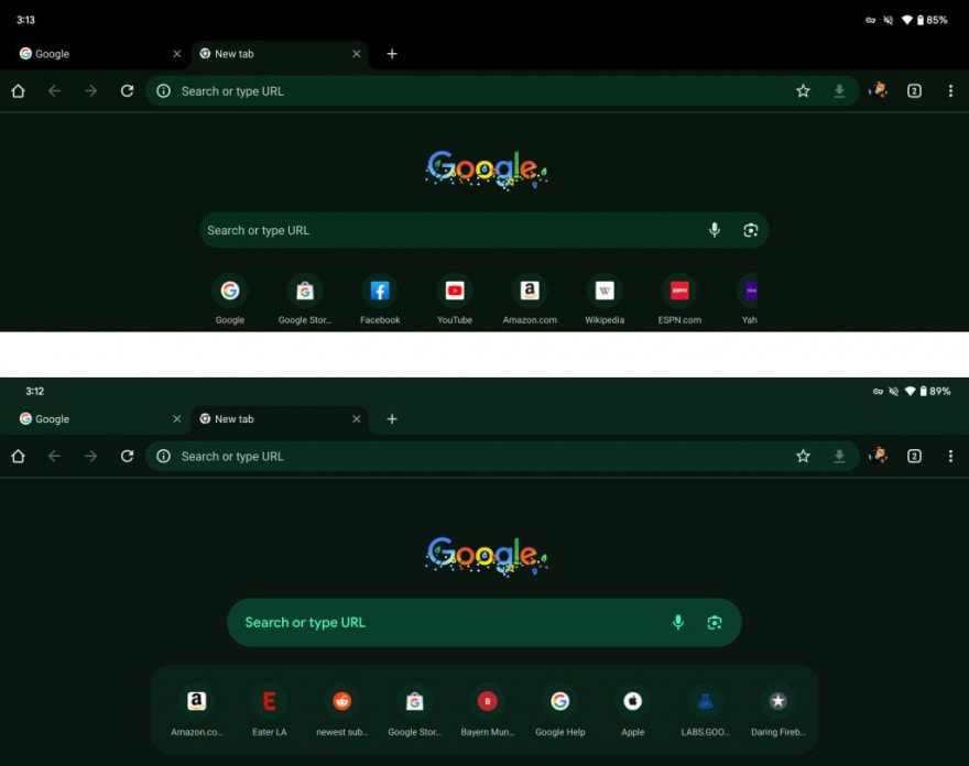
Above the old new Chrome page. Under the new one. Source: 9to5Google
9to5Google

