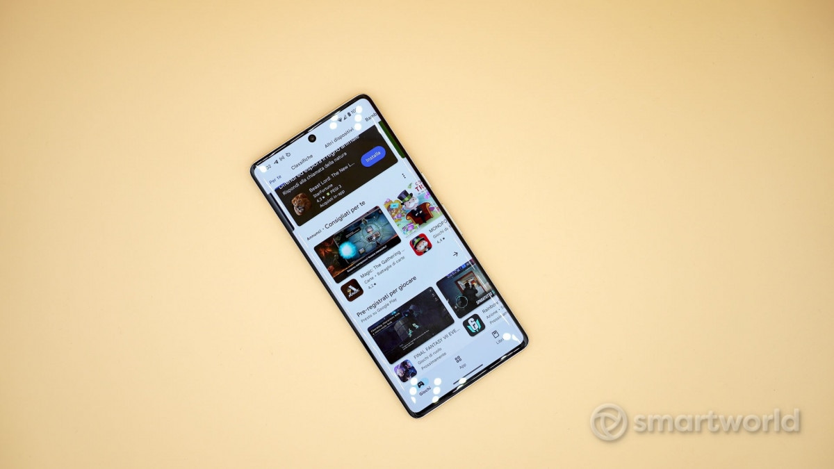
The Play Store, the digital store for all Android devices, is about to receive a significant update with the aim of improving the usability of the interface (here is our guide on how to get a refund from the Play Store). The main innovation lies in the rethinking of the bottom barwhich is enriched by new buttons and it becomes much more central for navigation in the app.
In fact, in addition to the classic ”Games”, ”Apps” and ”Books”, we will find the buttons ”Search” and ”Offers”. This choice made it possible to eliminate the top search bar, thus leaving room for just the Play Store logo in the top left corner (however highlighting a large unused space). They stay unchangedas can be seen from the images from 9to5Google, the notification bell and the personal profile avatar in the opposite corner.

As a consequence of the elimination of the top bar, for example perform a search it will be necessary to pass from the appropriate central button in the bottom navigation bar.
Afterwards you will find yourself in one new search tab divided into two sections: an upper ”grid” with some suggested searches and a lower one that encloses i various genres of video games. You can see how the suggestions above present all the same icon of the magnifying glass, while at the bottom each voice presents its own custom icon.
This new page might be a little confusing (given the abundance of icons) and perhaps a little too much ”full of text”but certainly the choice of keep high the search bar nullifies the ”convenience” introduced on the main page. In a period where smartphones are inexorably growing in size, having ainterface aimed at usability becomes absolutely central.
All this will be implemented with the version 40.1.19-31 of the Play Store, via a server-side update.